

Venetian Plaster Colors: Complete 2026 Guide by Vasari Lime Plaster & Paint

Venetian Plaster Colors: Complete 2026 Guide by Vasari Lime Plaster & Paint
Introduction: Why Venetian Plaster Colors Matter in 2026
This guide answers what venetian plaster colors are best right now, where to use them, and how matte vs high gloss finishes change the color. Venetian plaster is a luxury, lime-based decorative finish that creates depth, movement, and texture, while regular plaster is a basic construction material used primarily to smooth walls before painting.
Vasari Lime Plaster & Paint specializes in lime-based Venetian Plaster, Marmorino, Tadelakt, and lime paint, all tintable to custom colors. Our 2026 color insights are based on Vasari project data from the U.S. and Europe, designer feedback, and renovation requests from homeowners between 2003–2026.
Unlike regular plaster, which is a functional substrate that offers no significant visual interest, Venetian Plaster can mimic natural stone and provides a luxurious aesthetic with its depth and texture. These finishes behave differently from paint because the surface feels alive: mineral sheen, translucency, and color variation change as light moves across the walls.
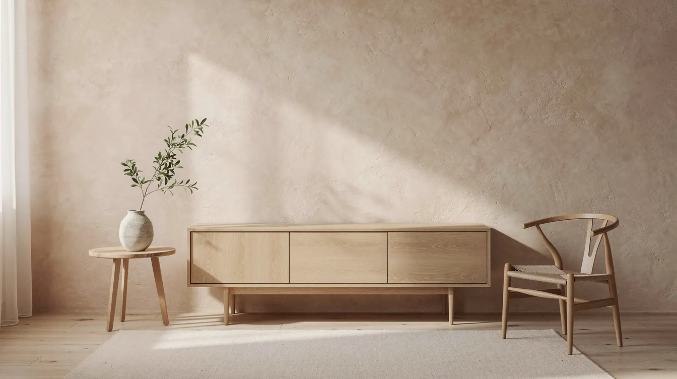
The Basics: How Venetian Plaster Color Works
Applying Venetian plaster involves layering thin coats of lime-based plaster using a flexible stainless steel trowel. Different multi-layer methods yield distinct textures, from high-gloss shine to rugged stone.
- Lime, marble dust, and mineral pigments interact with daylight and LEDs, so a warm beige may read soft in morning light and richer at night.
- Undertones-warm, cool, or neutral-are more visible in polished plaster than in flat paint because the finish reflects through layers.
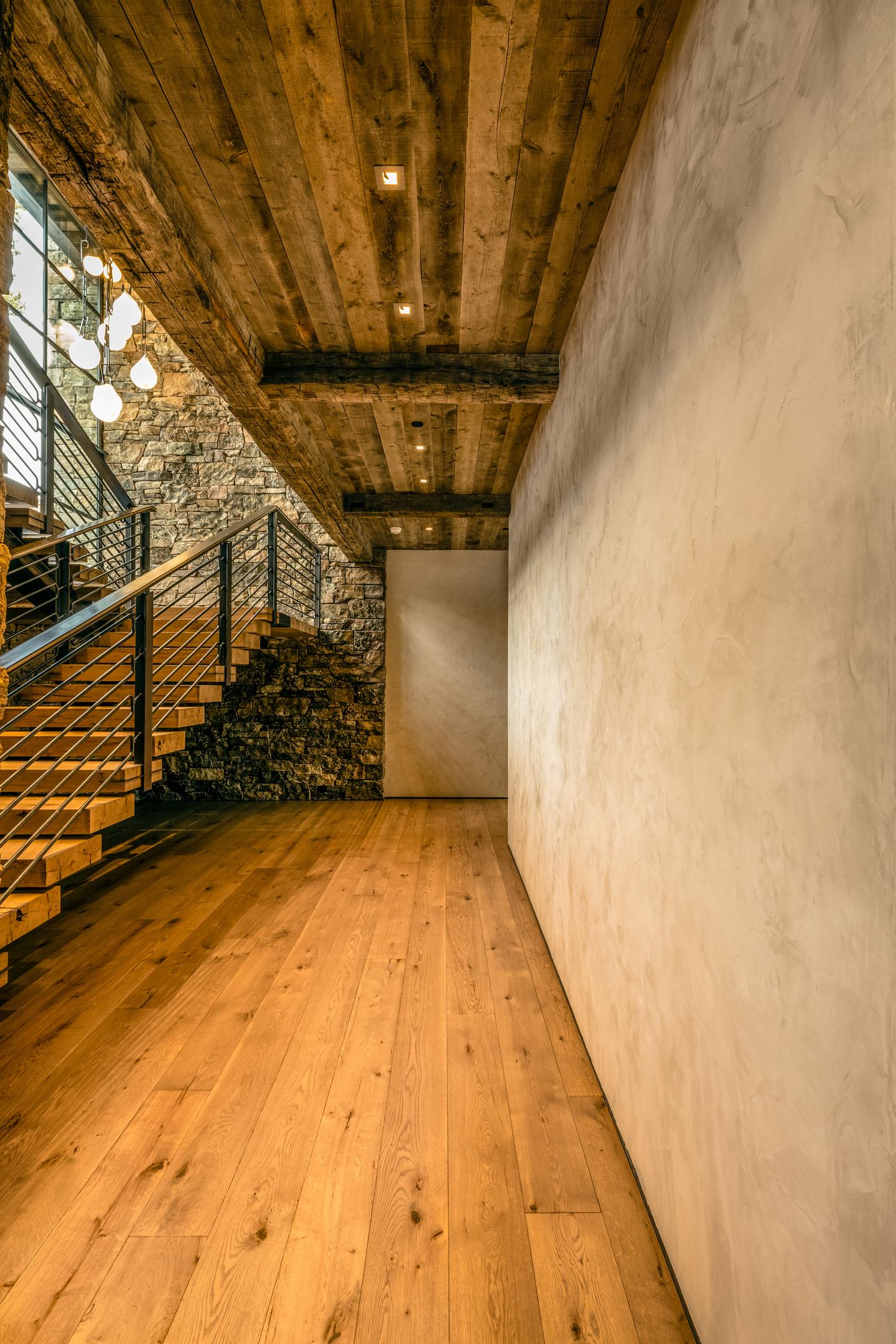
- Matte venetian plaster looks like chalky limestone or cut natural stone, satin Marmorino gives low sheen and high gloss venetian plaster delivers a polished, marble-like depth.
- Vasari colors are integrally tinted mineral plasters, not a surface coating, so the material resembles stone rather than a plastic film.
- Venetian plaster possesses a natural, burnished translucency, allowing colors to react uniquely to both artificial and natural light throughout the day.
- Venetian plaster colors can vary significantly based on the application technique and the specific product used, making it essential to refer to actual samples for accurate color selection.
Look at sample boards on site before approving a full room. A perfect showroom swatch can change beside your wood floors, cabinetry, and lighting.
Top Venetian Plaster Color Families for 2026
The six strongest color families for Venetian Plaster in 2026 are warm stone neutrals, soft clay and terracotta tones, dusty pink and blush hues, soft sky and sea blues, muted mineral greys and greens, and warm wheat and sand tones, reflecting trends in biophilic design and earthy luxury. Vasari is seeing these palettes most often in residential and boutique commercial projects, applied through Vasari Venetian Plaster, Marmorino, Tadelakt, and lime paint, with custom tinting available to match existing palettes.
Warm Stone Neutrals (Limestone, Travertine, Soft Beige)
These venetian plaster colors are inspired by warm limestone, creamy travertine, powdered stone grey, and light taupe. They are the safest starting point for timeless interiors because they do not depend on a short trend cycle. Use matte Venetian plaster or Marmorino for large walls, then add a light burnish in formal rooms for elegance without glare. Typical uses include living rooms, hallways, open-plan spaces, and calm hotel suites completed between 2022–2026.
Clay, Terracotta & Earthen Pinks
This family ranges from sun baked clay and soft terracotta to Dusty Blush Rose. Warm Clay Peach is favored in 2026 for its Mediterranean warmth and ability to complement natural materials, making it suitable for cozy hospitality spaces and bedrooms. Dusty Blush Rose is gaining popularity in 2026 as a warmer alternative to beige, known for its ability to soften natural light on textured walls and its compatibility with lime-based plaster systems. Satin or low-sheen Marmorino gives a hand-formed, rustic clay feel; slightly higher sheen adds depth on dining room or wine bar accent walls.
Soft Mineral Greens & Sage Greys
Soft Sage Grey is trending in 2026 for its calming sophistication and ability to enhance plaster texture while remaining neutral, making it ideal for feature walls and modern kitchens. Think sage grey, muted olive stone, and eucalyptus tones. Use matte finishes for a chalky, natural appearance or semi-gloss where subtle reflection is useful. These shades pair well with white oak, walnut, linen upholstery, and black metal hardware seen in 2023–2026 cabinetry trends.
Sky & Sea Blues
Misty Sky Blue is trending in 2026 for its calming and atmospheric qualities, making it ideal for wellness-driven interiors such as bathrooms and meditation rooms. Pale mineral blue-grey and deeper coastal blues recall the Adriatic and Pacific without feeling themed. high gloss venetian plaster in blue can resemble polished water or stone, while matte blue feels like cloudy sky or weathered fresco. Use blues on ceilings, bathrooms, and small feature walls where shifting light can move across the polished surface.
Charcoal, Ink & Deep Mineral Tones
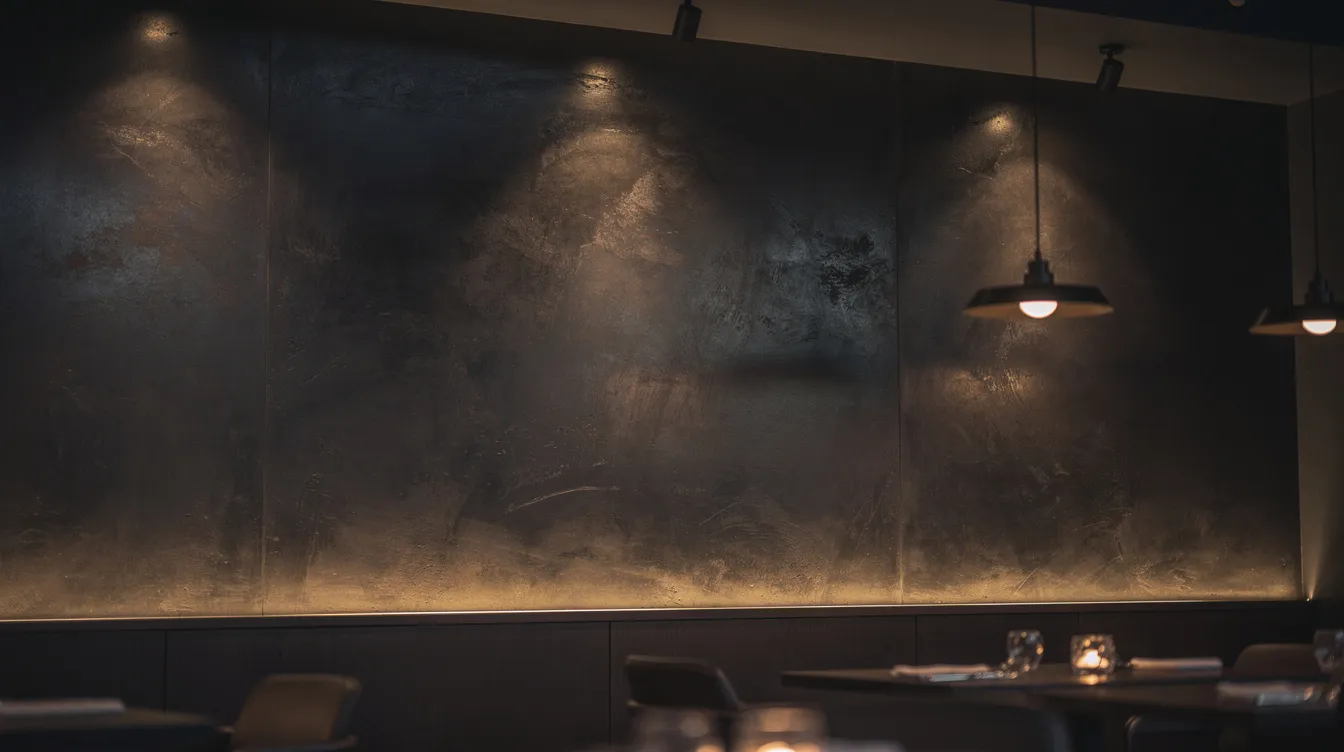
Deep charcoal, ink blue, mineral plum, and espresso brown feel like volcanic stone or dark marble. High reflectivity bounces natural light around the room, so high gloss Venetian plaster can make dark colors luxurious rather than oppressive. These tones suit dining rooms, bars, hotel lobbies, and modern living rooms that need drama in 2026 redesigns. Matte versions work for galleries, restaurants, and cinemas that want a cocooning, low-glare environment.
Wheat, Sand & Soft Gold Neutrals
Soft Wheat Yellow, pale sand, and muted straw-gold create a sun-washed glow without becoming yellow. These colors connect to Mediterranean villas and 1920s–1930s Californian homes often restored with lime plaster. Use matte Venetian plaster on ceilings and corridors, then light burnish a feature wall for gentle light bounce. Pair with natural stone floors, brass fixtures, and linen fabrics for cohesive warmth.
Matte vs High Gloss Venetian Plaster: How Sheen Changes Color
The same pigment can look entirely different in matte venetian plaster compared with high gloss venetian plaster because sheen controls reflection. Matte Vasari Marmorino or fine lime plaster resembles chalky limestone with low reflectivity; gloss creates a polished marble effect that can make color appear 10–20% richer under warm lighting. A clay beige in matte looks soft and powdery, while the same color in gloss can read like polished travertine.
The burnishing process matters. Friction Darkening is a phenomenon where the act of burnishing compresses the plaster matrix, creating contrast between compressed highlights and unburnished recessed areas. Light and mid-tone colors are the easiest to polish and provide the highest degree of translucency. Matte is usually best for bedrooms and large living areas; gloss works for feature walls, lobbies, bathrooms, and statement ceilings. Many Vasari projects combine both to layer texture and function.
How Venetian Plaster Mimics Natural Stone Through Color
Venetian plaster is often selected as a sustainable alternative to marble, limestone, and travertine slabs. Thin translucent layers, mineral pigment, and burnishing create cloudiness, veining, and depth: warm limestone beige, cool Carrara-inspired white with subtle grey, or soft travertine cream. Vasari lime plasters carbonate over time by re-absorbing CO₂, slowly hardening like stone and subtly softening color edges. Venetian Plaster is known for its durability and ability to harden over time, making it less prone to cracking and moisture damage compared to regular plaster, which is more sensitive to these issues. Designers in 2024–2026 often specify it instead of book-matched marble for budget, weight, and authenticity.
Choosing Venetian Plaster Colors Room by Room
Natural light, room size, and function determine the best venetian plaster colors and finish. The following suggestions assume Vasari lime-based products and can be tailored to matte, satin, or high gloss Venetian plaster.
Living Rooms & Great Rooms
Choose warm limestone beige, soft sage grey, or wheat tones for flexible backdrops. Matte or low sheen reduces glare on large walls, while one polished feature wall adds movement. Pair with natural oak, wool rugs, and linen upholstery. From 2023–2026, Vasari has seen consistent demand for warm limestone-like Venetian plaster colors instead of cool blue-greys in U.S. living rooms.
Kitchens & Dining Rooms
Use durable lime plasters in light stone neutrals, clay beiges, or soft mineral greens that match wood cabinets and stone counters. Satin to gloss behind banquettes delivers a rich candle-lit effect. Ink blue or charcoal works well for restaurants and wine bars completed since 2022. In busy kitchens, avoid stark white and choose colors that hide minor splashes, fingerprints, and daily traffic.
Bathrooms & Spa Spaces
For bathrooms and wellness rooms, use misty sky blue, light stone white, or sage green. High gloss Venetian plaster or well-burnished Marmorino can resemble polished natural stone when protected with the right sealer. Carrying one color from walls to ceiling can make a small bath feel taller. Vasari lime-based plasters are breathable and can help manage humidity when correctly detailed for moisture exposure.
Bedrooms
Bedrooms benefit from matte Venetian plaster in warm clay neutrals, dusty blush, or muted mineral green. Avoid high gloss on every wall; use it only for a small headboard panel if desired. Linen, cotton, wool, and warm white lighting complement the palette. Between 2023 and 2025, many Vasari clients shifted from grey paint to clay and blush Venetian plaster for primary bedrooms.
Hallways, Stairwells & Entryways
Light stone neutrals, wheat, or misty grey-beige brighten narrow spaces. A matte or soft satin surface hides scuffs better than gloss and feels more substantial than paint. Use a slightly deeper entry tone to hide marks from bags. Continuous Venetian plaster color from entry through hallway creates a cohesive architectural style in 2026 open-plan homes.
Commercial Interiors & Hospitality
Hotels, bars, and reception desks often use high gloss Venetian plaster in marble whites, ink blues, or charcoals. Wellness centers, yoga studios, and boutique shops often choose matte Marmorino in warm stone neutrals. Commercial clients from 2020–2026 increasingly select venetian plaster colors that echo natural stone to communicate longevity, clean design, and quality. For high-traffic spaces, choose durable Vasari systems and analyze traffic patterns before finalizing color and sheen.
How to Select the Right Venetian Plaster Color with Vasari
Choosing the right color is a collaboration between homeowner, designer, builder, and Vasari technical support.
- Gather inspiration from architecture, stone, fabric, and Pinterest images.
- Identify undertones in floors, cabinets, counters, and metal fixtures.
- Decide whether the project needs matte, satin, or high gloss Venetian plaster.
- Order sample boards and test them under actual daylight and evening lighting.
- Review product system needs: primer, base coat, finish, and sealer.
Vasari can color-match popular paint brands or natural stone references while adjusting for how lime absorbs and reflects color. If a sample feels wrong, reject it early, not after it is applied.
Future Color Directions for Venetian Plaster Beyond 2026
Designers planning for 2027–2030 should expect continued growth in warm earth tones, clay palettes, and desert-inspired neutrals. Soft mineral greens and blue-greys will remain strong in wellness architecture and biophilic design. Very pale, almost-white Venetian plaster with subtle mineral veining will become a refined paint alternative in minimalist interiors. Sustainable, low-VOC lime finishes will also matter more as indoor air quality standards expand in North America and Europe. In search data and project conversations, the overall trend is quieter color, more texture, and finishes that age beautifully as the plaster develops.
Conclusion: Creating Timeless Spaces with Venetian Plaster Color
Venetian plaster color is not just a trend decision. It is about echoing natural stone, light, depth, and texture in a finish that ages with the building.
Choose the color family first-stone neutral, clay, green, blue, dark mineral, wheat, or sand-then choose sheen based on mood and function. Matte creates softness; gloss creates reflection, richness, and drama.
Vasari Lime Plaster & Paint provides natural lime-based Venetian plaster, Marmorino, Tadelakt, and lime paint in custom colors for professionals and homeowners. Request samples, technical support, and color guidance for your upcoming project so you can achieve a beautiful, breathable, long lasting finish with confidence.


